7 Accessibility Sins I’m Tired of Pointing Out to UI/UX Designers
Dear UI/UX designer,
I’m tired of seeing these mistakes over and over again coming out from UI/UX designers I’ve worked with.
Some are exceptionally talented, producing beautiful web or app designs consistently, but almost all of them commit at least a few of these sins.
If you ever work with me, I will make sure you have this list burned indelibly into your mind before we start.
Technical note:
Most of my list items are based on the WCAG AA accessibility standards, which is the standard that most organisations (claim they) conform to. If you don’t know what things like WCAG, AA, and Accessibility refer to, go find out. These are basic stuff you should know.
Here are the 7 accessibility sins:
1. Text contrast too low
Yes, lower contrast text make the design more aesthetically pleasing, sophisticated, or even improve visual hierarchy. But what’s the point of pretty text when I have to strain my eyes to read it?
Go use a contrast checker. You’re gonna hate it, but a lot more people are going to hate you if you don’t.
This is the kind of contrast you love:
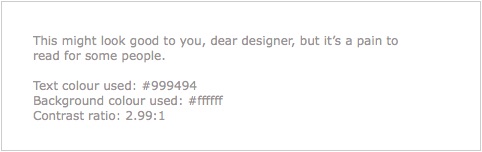
These are the exact colours used by a well-known organisation on their website. It was designed by a top international design firm. Shameful.
The contrast ratio for the above example is 2.99:1, which is less than the 4.5:1 minimum needed to pass the AA standard.
At 4.54:1, this next example just passes the AA standard (4.5:1), and it’s way more comfortable to read, even for someone with normal eyesight:

(For larger headline text, the contrast can be slightly lower at 3:1.)
2. Text size too small
If your text size is below 10 points, it’s too small. Like this:
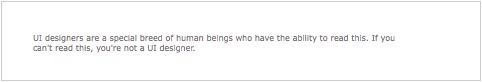
You should be able to read that if you’re a real designer. You should also be able to tell if a design is off by one pixel. But if you’re designing something for the rest of humanity that does not have razor sharp eyesight like yours, stop using minuscule text.
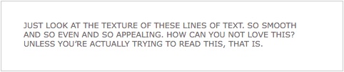
3. USING ALL CAPS
Using all caps is seductive, because it makes the texture of the text look so much more even and appealing.
Until you actually try to read the stuff – all caps is a pain to read quickly, simply because people are not used to it:
The exception is when you only have a couple of words, like in a short heading. Then it’s not so sinful.
According to WCAG, we should use upper and lower case according to the spelling rules of the text language.
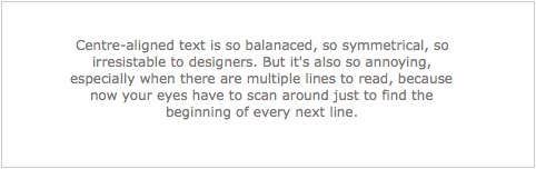
4. Using centre-aligned text
Centre-aligned text is so balanced, it’s so hard not to use it, especially if your design has other centred elements.
But as usual, centre-aligned text is harder to read especially when it spans multiple lines. This is because the reader has to spend effort locating the start of each line when reading.
The WCAG simply says this without much explanation:
Avoiding centrally aligned text
I’m way more reasonable – 1 or 2 lines of centre-aligned text is still OK; 3 is really pushing it. Beyond that, don’t. Use left-aligned text instead, unless you’re designing for Arabic or Hebrew or some other right-to-left language.
5. Using justified text
Some of you might then ask, “how about justified text”?
I question your aesthetic sense if you use it on a digital interface – good designers know to avoid this because its texture is uneven. In other words, it’s ugly.
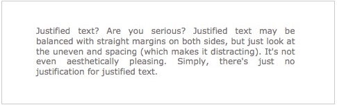
Besides its lack of aesthetic value, it also affects accessibility.
WCAG has this to say about justified text:
People with certain cognitive disabilities have problems reading text that is both left and right justified. The uneven spacing between words in fully justified text can cause “rivers of white” space to run down the page making reading difficult and in some cases impossible. Text justification can also cause words to be spaced closely together, so that it is difficult for them to locate word boundaries.
I hate to repeat myself, but just use left-aligned text already.
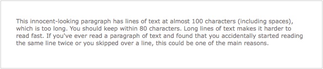
6. Text line width too wide
The good news is this mistake is becoming less problem – more designers realise that long line lengths is harder to read, especially when the text spans multiple lines.
The lines in this paragraph of text is too long (line width around 100 characters):
This one (line width up to 80 characters) is just within the WCAG AAA guideline:
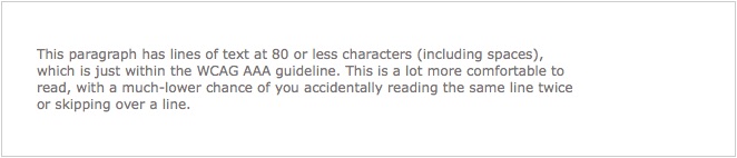
Just remember to keep your line widths within 80 characters or less.
(“HAH!” the sharper ones of you might point out, “the line length of this very post is way more than 80 characters! You hypocrite!”
You got me there. In my feeble defence, I didn’t design or code this template. Let’s forget this issue and move right along to the 7th sin…)
7. Using colour alone to convey information
Last but definitely not least, don’t use colour alone to convey information, for the sake of colourblind users. Yes, use colour, but add some other redundant way to convey information.
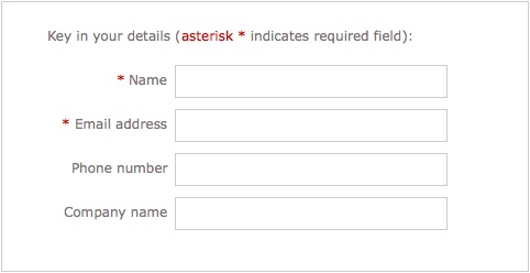
See this form:

Looks fine to you since you’re not colourblind (I haven’t met any colourblind UI/UX designers yet). But if we remove the colour information…
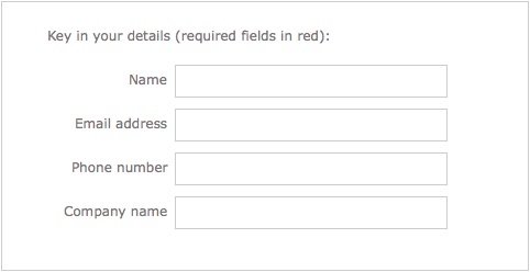
Not very useful now, is it?
Here’s an alternate way to do the same form that works better:
Same form with colour removed:
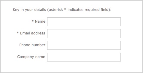
That wasn’t so hard, was it?
This issue is also common with diagrams and charts. See this chart with and without colour:
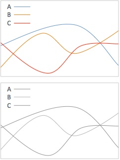
Even your normal users will have a problem if they print your chart in black/white.
The same chart that doesn’t just rely on colour:
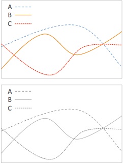
Just a little extra thought and effort and your problem is solved.
Moving on…
It’s time you realise that UI/UX design isn’t just about aesthetics, but about many other issues like accessibility. These 7 accessibility sins are by no means exhaustive; they’re just the most common I’ve encountered from designers who don’t know better.
If you’re a UI/UX designer, you now know better.
5 Steps to Create Good User Interview Questions
If you want to know how to come up with user interview questions for UX (user experience) research, check out this link:
5 Steps to Create Good User Interview Questions By @Metacole — A Comprehensive Guide
The article was written by Yu Sheng, a talented UX designer working at ReferralCandy; you might have noticed that he mentioned me as I was his UX coach.
It was a real privilege and pleasure to coach someone like him who was eager to learn and really understand UX.
Our focus was on user research interviews. I wanted to improve his thinking about the interview process, so that he wouldn’t just know how to handle one type of interview situation, but all kinds. It’s not just learning how to fish, but knowing how to fish with any available tool at hand and in any environment.
Here’s also what he wrote of the experience, which was rather flattering:
Coleman knows his stuff. Our coaching session focused on interviewing techniques, and he was able to explain and provide great tips for the processes of creating the questions, conducing the interview, and analysing the results. His coaching method challenges you to think, and to think better.
Massive thanks to Ruth from Byu-RHO Consulting for dragging me into this; and Zach, co-founder of ReferralCandy, for giving Ruth and me the opportunity to coach his guys.
Much has happened…
Much has happened in my working life this past year, despite my lack of updates here.
A key event was when I left Digital Boomerang. I’d been there for 4 and a half years, and it was one incredible journey of growth for me. It pushed me to my limits, beyond my limits, and expanded my limits.
The people I’ve worked with have been simply extraordinary: Pam, Sam, Jenny, Nat, Cindy, Yanling, Lala, Alexis, Yusuf, Sarah, Jose, Reg, Yuen, Jinyu, Jiayi, Vishal, and the stalwarts Elaine and Colin. Even Rupert, the cuddly office corgi who accompanied me in the office countless nights when I had to work late and needed some stress relief. And of course Charlotte (CEO, or Chief Entertainment Officer), who catalysed my growth spurt especially in the EQ side of things.
That journey drew to a close a year ago at the end of 2013 when I felt it was time for me to move on. Move on to what? I had completely no idea then. I was exploring different options and ideas, thinking of joining different companies or even venturing out on my own.
One fateful afternoon, I met with a friend to talk about an opportunity where she worked. We talked about their challenges, and where I could help. I sent my resume to her boss soon after.
Her boss called a few weeks later.
“We’d like you to work with us on a 3-month contract,” he told me, and gave me some details on the work.
“When do I start?” It didn’t take long for me to decide. I was, afterall, jobless looking for opportunities, and this was one. Besides, it would only be 3 months as an independent consultant.
The 3-month consulting gig eventually led to a permanent position there in Asian Mobile Banking, part of the Commonwealth Bank of Australia.
It’s been almost a year there already, and I’ve had the privilege to do many things, including:
- talking to scores of small business owners in different cities of Indonesia and Vietnam to really understand their needs as our customer
- coming up with innovations for a lending app (BizLoan), including some very compelling features (some not launched yet)
- conceptualising the app, its screens and interactions
- directing the user experience and design of the app
- working closely with fantastic team mates in Singapore, Jakarta, and Ho Chi Minh city, including customer experience people, designers, app developers, testers, analysts, and many other banking stakeholders to make the app possible
- setting up processes to continually improve the customer experience of all our apps
- guiding and coaching customer experience colleagues in Indonesia and Vietnam in user research
Overall it’s been an incredibly fun and fulfilling ride, particularly with the successful launch of the BizLoan app in Ho Chi Minh city last month – in our first week, there were already more than 100 downloads every single day.
It’s now 2015, and while much has happened last year, much will also be happening this year.
Watch this space.
When In Doubt, Be Kind
I’ve been busier than ever since joining my current company 3 and a half years ago (which might help to explain my dismal average of less than posts per year on this in the past 2 years), and one of the things I’ve been learning more recently is in the area of leadership.
Leadership is not one of my natural talents, and in fact the idea of working with human beings used to be quite distasteful to me (the unpredictability and irrationality of humans unsettled me). This meant that being a leader of humans was naturally out of the question.
Fortunately, I work in an incredibly supportive environment with a wonderful CEO and really awesome colleagues, which makes it so much easier for me grow in my leadership. I’ve also been reading more and trying to put into practice what I’ve learnt about being a good leader. One of the quotes I’ve come across (I can’t remember where) is:
When in doubt, be kind. When not in doubt, be kind anyway.
It’s been on the back of my mind for months, and I’ve been meaning to put it into practice. Then recently, the opportunity came.
Our company was bidding for a contract that was practically already ours already. We were the incumbent, which in this case gave us a huge competitive advantage, and the client already had a great working relationship with us. Except that my colleague simply forgot to submit the bid. We lost that contract because of that.
Besides the pain of losing a major contract because of a very silly mistake, the client was very upset.
I wasn’t working directly with the colleague in question, but I could imagine my knee-jerk reaction – I’d probably be resisting the urge to blow my top, while sternly telling the perpetuator how unacceptable that was, and perhaps throw in some unsavoury consequences so that the lesson would be indelibly seared into the colleague’s neural pathways so that it would never happen again.
Not exactly a kind reaction.
Our CEO’s response, however, was quite different. There was no anger at all, and the CEO reminded us about the contributions of that colleague to the company. It reminded me of the quote I’ve been wanting to put into practice.
When in doubt, be kind.
When things go awry, it’s so easy to zoom in on that one negative incident and lose focus on everything else.
It may take a while before kindness becomes instinct , but I’m sure I can do a little better next time.
Have you Googled your Name Lately?
(Update: the link is outdated, so I’ve pasted the whole article below.)
I wrote an article recently with the same title, Have you Googled your Name Lately?
Here’s a snippet:
The last time I tried, Google spat out a frightening array of information about me, including blog posts by me, videos of me, events I attended, and even a photo of my very wild birthday party with lots of scantily-clad women. Thankfully, the last photo turned out to be that of my namesake in San Francisco.
This was written for Challenge Magazine (Online), the magazine for the Singapore Public Service, but you don’t have to work for the Singapore government to benefit from this. Useful for those who aren’t internet gurus 🙂
(Wow, this is my first post of 2012 – shameful!)
Have You Googled Your Name Lately?
It may seem like an egotistical thing to do, but it may surprise you what kind of information gets unearthed, especially if you have a unique name (like mine).
The last time I tried, Google spat out a frightening array of information about me, including blog posts by me, videos of me, events I attended, and even a photo of my very wild birthday party with lots of scantily-clad women. Thankfully, the last photo turned out to be that of my namesake in San Francisco.
Things you post on the Internet tend to stay there for a long time. However, our very human need for self-expression and the fact that it’s so easy to post things online makes it impossible for us to not put things up on the Internet.
I thus present a few tips to help you survive with your online reputation intact:
Tip 1: Use a nickname if you’re not sure
If you’re posting something online, think for a moment – will I be ashamed of this 10 years later? If it’s a ‘yes’ or you’re not sure, post using a nickname instead.
Tip 2: Use an untraceable nickname
Make sure your nickname cannot be linked to you.
For example, if your nickname is “superwondergirl83”, searching on Facebook for “superwondergirl83@yahoo.com” shouldn’t lead to your Facebook profile!
Tip 3: Behave yourself IRL (in real life)
At the end of the day, you’ll have to start behaving. No matter how careful you are about what you post online, others can also post stuff about you.
So think twice about downing that one more tequila shot, especially if you’re already slumped on the table in the club.
Now, what if these tips came too late, and Google throws up that photo of you passed out in your own pool of vomit at Zouk?
Here are some tips for you that could work. (Your mileage may vary.)
Tip 1: Delete what you can
If you have control over the content on that site, such as your own blog or your own Facebook account, delete it. There’s a chance that it might disappear forever.
The Internet may keep information for a long time, but if you’re lucky, things can disappear forever without a trace, even for Google.
Tip 2: Ask nicely
If it was someone else who posted that nasty bit of information about you, ask them nicely to take it down. The keyword here is ‘nicely’. No one is obligated to take it down, so you’re relying solely on their goodwill. Good luck.
Tip 3: Get a lawyer
This isn’t really a tip because I don’t recommend it, but it can sometimes work.
You can get a lawyer to write a scary letter to ask the site to take it down. Many sites will comply, just to avoid trouble.
However, this method comes across as bullying, and nobody likes a bully. If people are unhappy enough, an unintended consequence could be the Streisand effect – people will try to publicise widely the very information you’re trying to hide.
So really, don’t get a lawyer.
It’s cheaper and better to behave yourself.
Permanent Whiteboard Markers
We were having a brainstorm at a client’s meeting room when when someone made the classic mistake of writing on the whiteboard with a permanent marker.
That wouldn’t have happened if the permanent marker wasn’t put at the whiteboard, together with all the other (non-permanent) whiteboard markers. And that wouldn’t have happened if the permanent marker didn’t look like this:

In case you didn’t notice, the one above is the permanent marker; the one below is the (erasable) whiteboard marker.
Things like this make you wonder – what were they thinking?
(In case you’re wondering what I did to the permanent marker after taking the photo – I put it away outside the meeting room.)
On a related note… another thing that puzzles me, is how when someone writes on a whiteboard and finds that the marker is out of ink, they often just place the marker back where they got it from (and try their luck with another marker).
As for me, I dispose it ASAP.
No one else needs to waste time on that marker ever again.
TEDx Singapore Talk: The Princess, the Witch, and the PowerPoint
The talk I gave during TEDx Singapore 8 months ago is now online!
(YouTube link – The Princess, the Witch, and the PowerPoint)
The talk, entitled The Princess, the Witch, and the PowerPoint is a fairy tale illustrating some bad PowerPoint design practices. It’s really a minor revision of the version I gave 3 years ago.
Enjoy 🙂
Credits:
A huge thank you to the TEDx Singapore folks, especially those who put in an incredible amount of effort producing and editing the video.
And all who attended my talk, who added their laughter and made it so much more fun for me to present it.
The Psychology of Eating
The amount of food we eat is influenced by many things around us, and we don’t even know it.
If we use a bigger plate for instance, we’ll put more food on the plate (and end up eating more). Or if we were presented with more variety, we’ll also end up eating more. Or if you eat with more people (vs eating alone), you’ll also end up eating more (unless you’re already a heavy eater, then you’d end up eating less).
The great thing about all this is that this can also help you lose weight effortlessly, without needing much willpower. You can tweak your environment so that you’ll end up eating less, such as by using smaller plates or having less variety. And because the stomach is really a bad judge of how much we’ve eaten, if you just eat 20% less using these tricks, your stomach can’t even tell. You won’t feel deprived.
And over time, you’ll slowly but surely lose weight. Just by drinking one less can of Coke everyday for instance would make you 6kg lighter in a year. Just one less can of Coke.
That, in a gist was what my talk today at BarCamp Singapore 6 was about. I don’t intend to share my slides, partly because they’re in a mess, but more because the research findings I talked about is mostly from the book Mindless Eating: Why We Eat More Than We Think by Dr Brian Wansink (Amazon affiliate link), and you should buy or borrow it for yourself.
Mindless Eating is one of those rare non-fiction books combine sound and accurate information with fascinating insights and are entertaining and easy to read. I first read it from a library, but it was so good that I had to own one for myself.
It’s filled with numerous experiments that give insight into things that affect how much we eat, and how we can manipulate our environment so we will cut down the amount we eat.
One last tip. If you’re eating stuff like chicken wings or other foods that leave behind some ‘residue’ (like bones or shells or sticks etc.), don’t let the waiter clear it – you’ll end up eating less with the ‘residue’ in sight.
Thanks to all who attended my talk!
*** Update ***
Designer/illustrator Bernadette Quah drew a lovely visualization of my key points while attending my talk:

The Open Web
I gave this presentation for the Mozilla Drumbeat Challenge at Neoteny Singapore Camp 1 about a week ago.
The presentation was for this:
Category 2. The Ultimate Open Web Presentation
We’re looking for the ultimate presentation that explains the open web and why it matters. You’ve got 5 minutes — describe the open web in a way that will excite and illuminate.
My presentation lasted less than 5 minutes, but it took me many hours to prepare – coming up with different ideas, weighing the different ideas, testing out ideas with different people, and finally sitting down and working on the slides.
I decided to take a somewhat poetic approach (someone called it an “ode”) to resonate with the emotions more than the intellect. It was a risk, since I would be presenting to a primarily geek audience. But I took it anyway.
And it paid off, since the judges liked it, and declared mine the “best presentation”.
Lucian Teo also did a really nice presentation on the Open Web.
The other category of talks (for concrete project ideas to make the web better) was won by Preetam Rai, who presented on a Hat-Tip System for Free Content.
A big thank you to those who gave me feedback on my ideas before they were fully formed, including Lucian and Preetam! Bernard Leong too, for encouraging me to present, and Mark Surman for organizing this. And finally my colleagues at Digital Boomerang for their support, including letting me present to them so I could record the audio for the slideshare presentation.

leave a comment